Blog Archives
The Road To The Fall Classic: Picking The Division Series
As many of you know, I make a habit out of picking the playoffs by best dressed teams, so were going to do the same here at JJB for this year’s MLB playoffs. My beloved Detroit Tigers clinched the division for the first time in my life which makes me incredibly excited, and a bevy of usual teams (Yankees, Phillies, Rays) are joined by a few teams that have rebounded to make it back to the playoffs for the first time in a while (Milwaukee, Arizona, Detroit.) As usual, let’s go series by series and pick ’em by uni.
(1) New York Yankees vs. (3) Detroit Tigers


The Yankees have one of the most, if not the most iconic looks in all of baseball. The pinstripe home uniforms have been a staple since they were the New York Highlanders, and that road uniform you see above, has been unchanged since 1918. Now there are two ways that I look at this as a uni enthusiast. A. You do not mess with success, and when a look is as timeless as this, you leave it be. That NY symbol is an icon of American pop culture. However, B. Maybe after nearly 100 years, it could be time to change it up just a little bit, no logo changes, but do at least something different to that uniform so as to not bore us with the same old look.
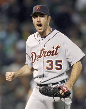
The Yankees opponents are the AL Central Division champion Detroit Tigers. Much like the Yankees, the Tigers have a clean and crisp home uniform, simple white and blue, with the always classic Olde English ‘D’. The Tigers road uniforms are a slightly different affair, same uniform template, the but script Detroit is a very nice touch. For this matchup, I am going to pick The Tigers for the sole reason that the team has different home and road caps, it is something very subtle, yet noticeable, and sends the Tigers into the ALCS.
(2) Texas Rangers vs. (4) Tampa Bay Rays
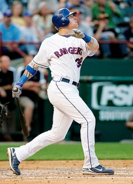


A battle of teams with uniforms that kinda make you say meh. Texas has worn the same uniform set since the days of A-Rod. The color scheme does do them nicely though, the uniforms are not too busy or too plain, and the alternate tops that they wore in Game 1 are always nice to see on a limited basis. Tampa Bay on the other hand went from having a fairly unique uniform set from 1998-2007 without much change but upon their redesign in 2008, their uniforms became more practical, but lost their personality when they dropped the ‘Devil Rays’ and became the ‘Rays’. However, that light blue alternate the ‘Rays’ have is awesome. For this one, I’ll go with the team that kept their identity and take Texas.
(1) Philadelphia Phillies vs. (4) St. Louis Cardinals


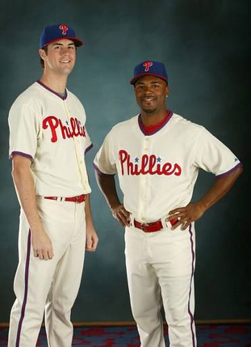
Two old school NL ballclubs clash in the NLDS with perennial powerhouse Philadelphia against a rejuvenated St. Louis team. The Phillies have their standard pinstriped home uniform and its twin road grey, both of which have a classy, yet modern style to them. There is also a chance the Phillies could break out their Sunday alternates at one point during the series as they have during the past. The Cardinals on the other hand have almost identical home and road uniforms, following the basic template of white and gray. However, the Cardinals participate in the same trend as the Tigers and wear a different cap on the road which looks more natural than having the red cap with the road grays. As nice as the Phillies uniforms are, I’m going to go with the Cardinals as this one really just boils down to personal choice.
(2) Milwaukee Brewers vs. (3) Arizona Diamondbacks.


Finally we have the matchup that I am looking forward to the most after the Tigers vs. Yankees, I have vague support for both teams, so I am glad to see them in the playoffs. The Brewers have a very crisp uniform set that is nicely accented by gold (representing a barley oat). My personal favorite is the Brewers third shirt, which could very well make an appearance this series but most likely will not. Arizona on the other hand took a few steps backward in my book when they completely redesigned their look in 2007. The Diamondbacks 1998-2006 away uniform was one of my favorites in baseball, especially with the black, gold and purple cap. The current uniforms are not bad, and actually look fairly good, but due to some poor design on the home uniforms, the script can easily be manipulated by rival fans. I’ve got to go classic here and go with Milwaukee, however if this were with Arizona’s old design, it would be much closer.
So there you have it, my uniform matchup picks for the League Championship Series
(2) Texas vs. (3) Detroit
(2) Milwaukee vs. (4) St. Louis
Ink Stains: Not quite article worthy, but important news for your uniform diet –
- The Ravens will be wearing their blackout uniform set today against the Jets for their Sunday Night Football Matchup
- Say goodbye, and buy a Flordia Marlins 5950 while you still can, last Wednesday’s game was the final time you will see the Florida Marlins as they will re-debut as the Miami Marlins next spring in Black and Orange, Chris Creamer provides an excellent logo history of the Marlins
- Get ready for PINK with your football. October is Breast Cancer awareness month, and as you may have seen the past few seasons, many NFL players will be wearing pink-accented gear
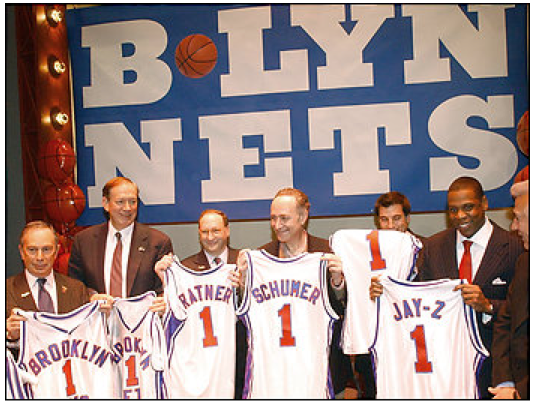
- Even if there isn’t an NBA season, professional sports are returning to Brooklyn, no word if these will be the final uniforms for the team.
- Nebraska’s inagural B1G game against Wisconsin was played in opposite uniforms, considering the schools’ similar color schemes.
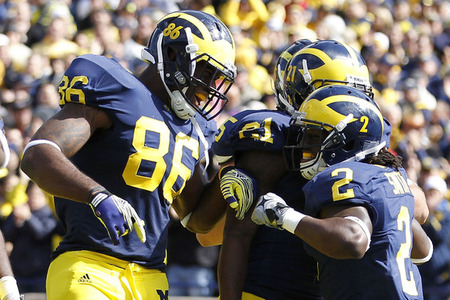
- Michigan debuted a new change to their helmets during their opening B1G game against Minnesota, helmet numbers. Its a new tradition instituted by first year head coach Brady Hoke for at minimum the rest of the season. There has been mixed reception so far from Wolverine fans.
